Deep Controls add-on
The Deep Controls add-on enables Storybook controls for nested component properties, allowing you to interactively modify deeply nested props directly from the Controls panel without having to manually edit complex object structures.
Overview
By default, Storybook's Controls panel displays object-type props as a single collapsible JSON editor. The Deep Controls add-on extends this functionality by exposing individual nested properties as separate, dedicated controls with their own type-specific inputs (radio buttons, checkboxes, text fields, etc.).
Basic usage
Minimal setup
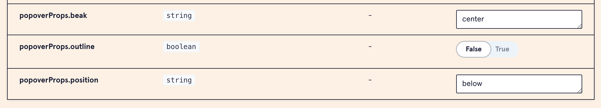
The simplest way to use deep controls is to just provide nested args. The add-on will automatically create controls for them:
import type { Meta, StoryObj } from '@storybook/react'; import type { TypeWithDeepControls } from 'storybook-addon-deep-controls'; import { MyComponent } from './MyComponent'; const meta: TypeWithDeepControls<Meta<typeof MyComponent>> = { component: MyComponent, args: { popoverProps: { beak: 'center', outline: false, position: 'below', }, }, }; export default meta; type Story = StoryObj<typeof MyComponent>;
That's it! The add-on will automatically generate controls for popoverProps.beak, popoverProps.outline, and popoverProps.position based on their inferred types:
Customizing controls
You only need to define argTypes if you want to customize the controls, types, or add descriptions. Otherwise, the default behavior works automatically.
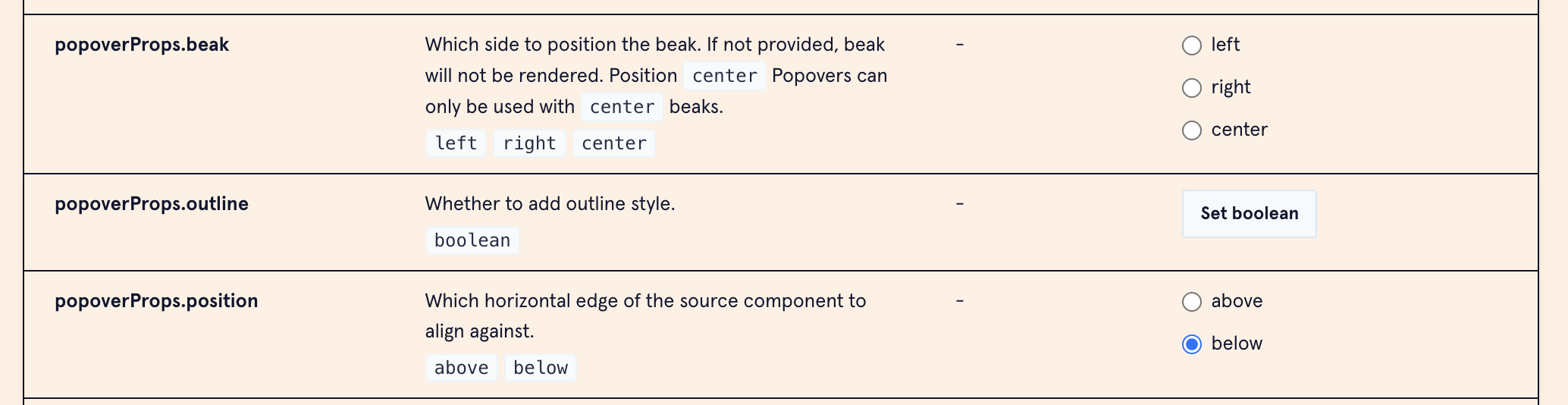
To customize controls, use dot notation in argTypes:
const meta: TypeWithDeepControls<Meta<typeof MyComponent>> = { component: MyComponent, args: { popoverProps: { beak: 'center', outline: false, }, }, argTypes: { 'popoverProps.beak': { control: 'radio', options: ['left', 'right', 'center'], table: { type: { summary: 'left | right | center' }, }, description: 'Which side to position the beak.', }, 'popoverProps.outline': { control: 'boolean', table: { type: { summary: 'boolean' }, }, description: 'Whether to add outline style.', }, }, }; export default meta; type Story = StoryObj<typeof MyComponent>;
The controls panel will now show the following:
Typescript errors
If you see TypeScript errors when using dot notation in argTypes, you may need to add the TypeWithDeepControls type to your story and wrap your Meta type in it (or Story type if you're using a story-level argTypes).
import type { TypeWithDeepControls } from 'storybook-addon-deep-controls'; import type { Meta, StoryObj } from '@storybook/react'; const meta: TypeWithDeepControls<Meta<typeof MyComponent>> = { component: MyComponent, args: { ... }, argTypes: { ... }, };
When to use argTypes
Define argTypes for nested properties when you want to:
- Restrict options: Use
radioorselectcontrols with specific options instead of free-form text - Add descriptions: Provide helpful documentation for each property
- Customize controls: Override the auto-detected control type (e.g., use a range slider for numbers)
- Specify type summaries: Add type information to the documentation table
- Set default values: Show default values in the documentation
- Disable the parent object: Hide the parent object from the controls table to reduce clutter (only useful when you're providing default args; see below)
Hiding the parent object
When you DO NOT provide default args for a nested object but are setting the argTypes for the nested properties, the controls panel will show both the parent object AND the individual nested properties. For example:
args: {}, argTypes: { 'infotip.info': { control: 'text', table: { type: { summary: 'string' }, }, description: 'The text for the infotip.', }, 'infotip.emphasis': { control: 'radio', options: ['high', 'low'], table: { type: { summary: 'high | low' }, }, }, }
This will display:
infotip(the entire object)infotip.info(individual property)infotip.emphasis(individual property)
To avoid this redundancy and keep your controls panel clean, disable the parent object in argTypes:
argTypes: { infotip: { table: { disable: true, // Hides the parent object }, }, }
Advanced usage
Reusable argTypes
For props that are reused across multiple components (like infotip), extract the argTypes to a shared module:
// .storybook/argTypes/infotip.tsx export const infotipNestedArgTypes = { infotip: { table: { disable: true, // Hide parent to avoid redundancy when default args are provided }, }, 'infotip.emphasis': { control: 'radio', options: ['high', 'low'], table: { defaultValue: { summary: 'low' }, type: { summary: 'high | low' }, }, }, 'infotip.alignment': { control: 'radio', options: ['bottom-left', 'bottom-right', 'top-left', 'top-right'], table: { defaultValue: { summary: 'top-right' }, type: { summary: 'bottom-left | bottom-right | top-left | top-right' }, }, }, 'infotip.narrow': { control: 'boolean', table: { type: { summary: 'boolean' }, }, description: 'Forces the tooltip to be its narrowest width. For use along the edges of the page or other tight spaces.', }, 'infotip.info': { control: 'text', table: { type: { summary: 'string' }, }, description: 'The text for the infotip.', }, } as const;
Using in a story:
import type { Meta, StoryObj } from '@storybook/react'; import type { TypeWithDeepControls } from 'storybook-addon-deep-controls'; import { infotipNestedArgTypes } from '~styleguide/argTypes'; const meta: TypeWithDeepControls<Meta<typeof FormGroup>> = { component: FormGroup, argTypes: { ...infotipNestedArgTypes, // Add other component-specific argTypes here }, }; export default meta;
Examples in the codebase
-
Demonstrates deep controls with default args for
cta. -
Demonstrates deep controls with custom
argTypesforpopoverPropswith multiple nested properties likebeak,position,align, and offsets. -
Uses the reusable
infotipNestedArgTypesto expose infotip configuration.